Design capability mapping
Mapping UNSW’s design activity in a graph
At UNSW’s Design Next, we needed a comprehensive mapping of current design activities across the university. Design Next was a cross-faculty unit aiming to develop design across the university in teaching and research. My task was to compile a list of everyone researching, applying, and publishing in design. With that data in hand, we can work out where UNSW’s strengths lie and with whom.
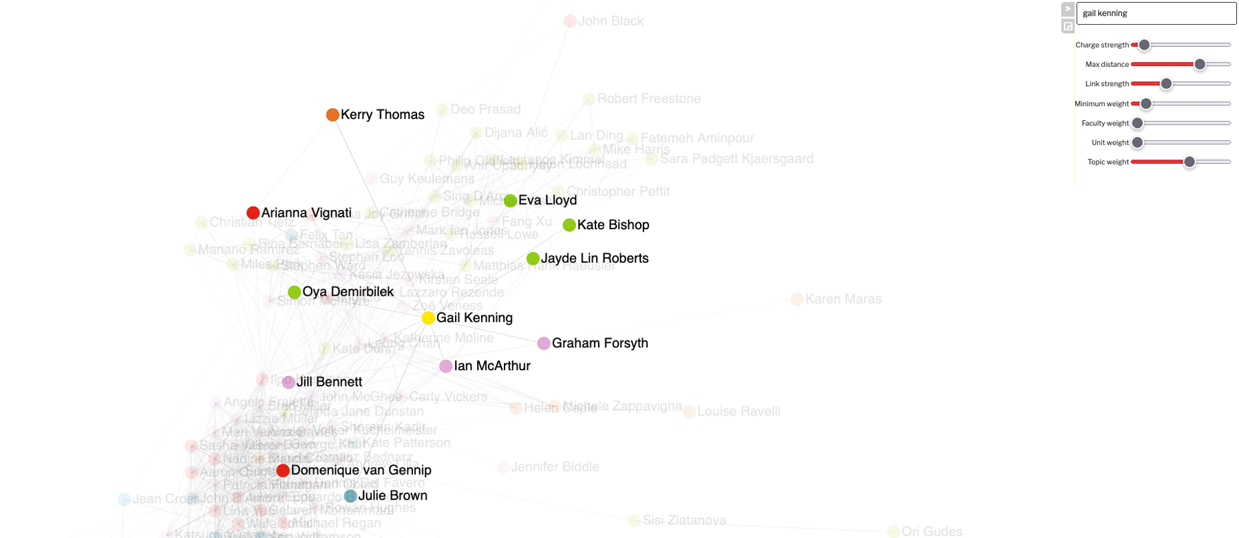
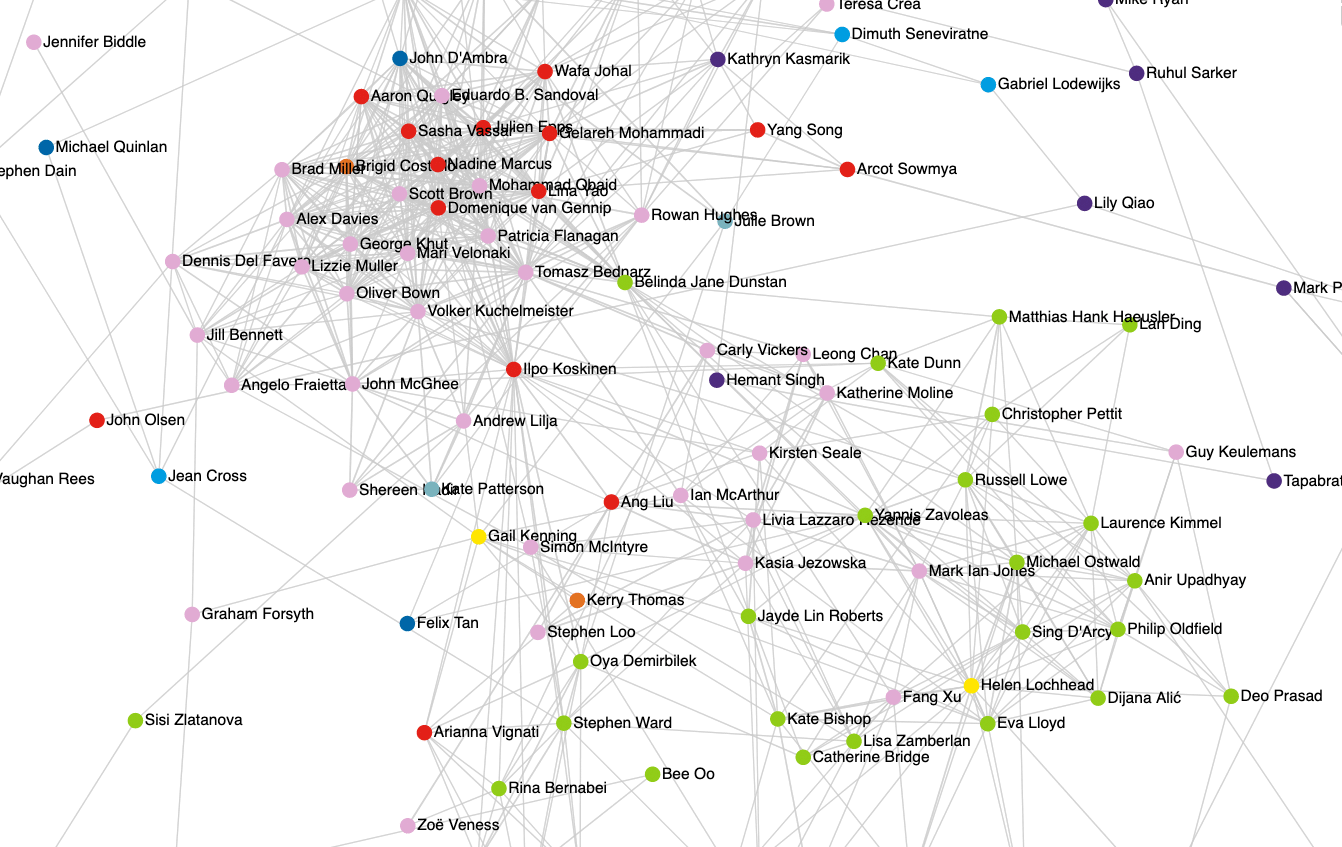
To support my analysis, I built a bespoke network graph visualisation web app.
Explore the graph webapp yourself!Finding everyone active in design
I gathered info from:
- Published material classified under the 1203 Field of Research-code in recent years;
- For future readers, the 1203 code has now changed but was design-focused;
- Faculties’ staff lists;
- UNSW Find a Researcher page;
- Google Scholar;
- Once I had Scholar IDs for academics, a small python script helped to scrape citation data;
- Talks with people across campus throughout our fact-finding exercise.
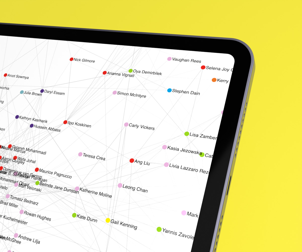
I ended up with a list of 150+ academics active in design. I catalogued their topics of expertise and publicly available information such as their personal website and social media handles.
Finding commonality through social network graphs
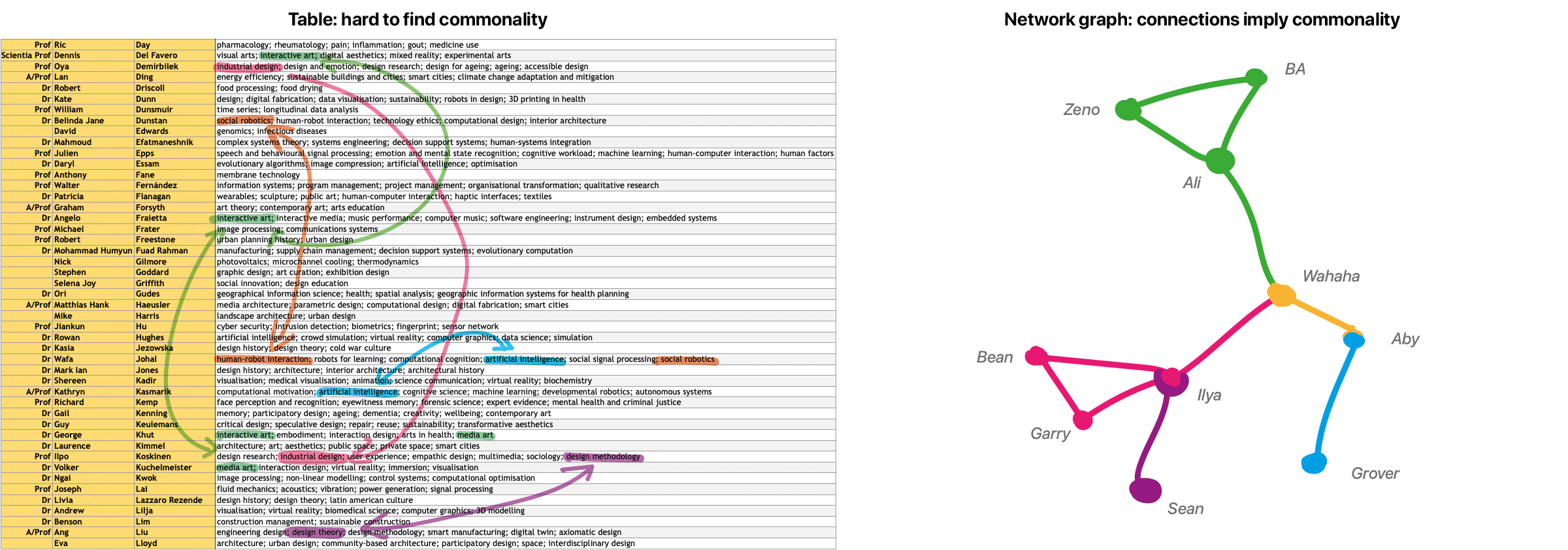
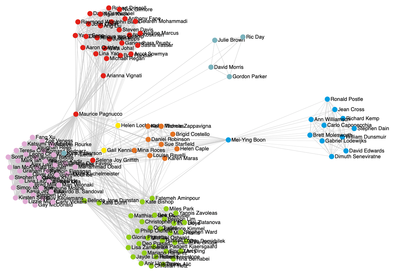
Finding commonality between people and strengths across the university required a more connected representation than a large spreadsheet could offer me. So I turned to a graph representation. In a graph network, every person is a node that may be connected to other nodes based on similarity. For example, two architects would be closely linked, whereas an architect and a robotics designer wouldn’t be so close. This allowed me to find clusters of connected people, driven by data on their research topics, faculty, School, etc.
UI design and development
Because I couldn’t find a good existing network graph solution, I development my own graph representation in a web app. Development was done in javascript, HTML, and CSS. It allowed me live control over the parameters of the graph, adjusting its composition, which helped me make sense of the data (and enjoy the process a little more too!).
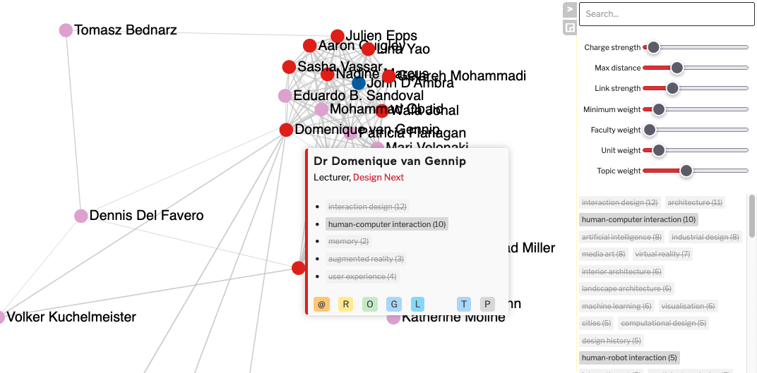
Because the graph is best seen and enjoyed fullscreen, my focus was to keep UI elements out of the way. The righthand bar (for search, graph settings, and topics selection) can be folded away to give maximum space to the graph. When open, it’s semi-transparent to show as much of the graph as possible.
During development and early use, I realised that searching for topics or people would speed up my ability to get useful information out of the app. So whenever someone starts typing, the app will automatically select the searchbox and starts filtering. There’s no need to first hunt for and select the searchbox. Pressing Esc resets the search terms, allowing for fast changes to other terms.
Ideas for UX improvements
To improve the user experience, I’d improve explanations for the control sliders as these may not be self-explanatory. Toggling topics on and off is not intuitive, so it should be explained somewhere. This is compounded by the potential slow response from the browser when it has to regenerate the graph, reducing immediate feedback. I can imagine others unfamiliar with the app struggling with these things.
Explore the design graph online
Explore the webapp graph yourself!A few pointers for using the web app
The webapp was developed only for internal use, so it lacks the polish I’d desire for a more widely used tool. It’s still fun to explore the data (let’s face it: spreadsheets are dull, graphs are cool).
- It’s a little slow to load as the page generates the graph on opening.
- Making changes to the graph (when using the sliders or toggling topics) may also cause a noticeable delay.
- Performance depends on the browser used: as of early 2025, differences are small though.
- Zoom in and out as usual. Controls can be sensitive.
- Pan around the graph by clicking, holding and moving the mouse.
- Start typing to search or use the top-right search box. It’ll search most data fields.
- Enable or disable a topic by clicking on its label.
- Right-click a label to exclusively enable it (and thereby disable all other topics).
- Hover over a person’s dot to get more info on them, and get links to their data, website, etc.
Reflection
All data shown in this version was publicly available and correct in early 2020. Significant organisational changes later in the year affected many people listed here, so it’s not quite representative even just one year on. Not long after developing this, it became clear the data was soon going to be stale and without a return to a stable situation expected in the near-future, we paused our capability mapping.