Maya's Products branding

Building a brand and website for baby products

When

2021

Client

Maya’s Products

Team

Doménique van Gennip

My role

Origins of Maya’s Products

In 2020, my wife started a small business to import and sell fabric products for babies and young children. She had landed on a great product, dry sheets, that could function as change mats and as underlays for nappy-free time. She needed a business identity, visual design, and a website for her online store. The name, Maya’s Products, came easy: a reference to our daughter born in the same year.

Brand development

Maya’s Products would focus on 0-2 year olds and their parents, with an emphasis on products that increase wellbeing and make life easier. While the launch product (dry sheets) isn’t a fashion item, it’s very functional and the brand should reflect that simplicity. We also wanted to emphasise the small nature of the business with a direct connection to our own parenting experience. Thus, the brand identity evolved around two phrases: ‘we care’ and ‘helping parents spend time with their bub.’
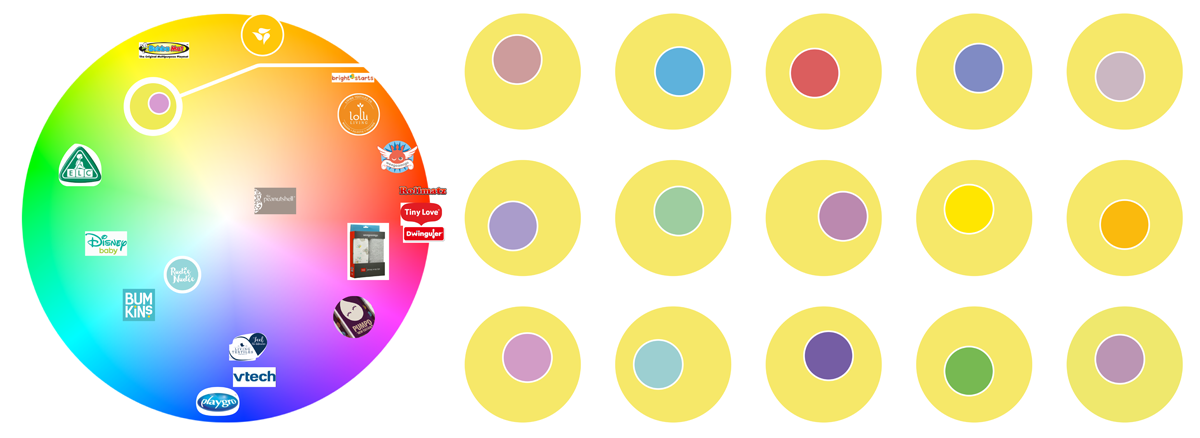
alt
Competitor analysis showed brands active in the same market and their key colours. For Maya's Products, I picked a relatively underused shade of yellow. A purple secondary colour was chosen from the options shown on the right, based on the desire to stay away from soft pinks and blues that are overused in young childrens' products. Eventually, we adopted a more saturated, reddisch purple to stand out in retail environments.

Logo design

alt
Some of the early, quick sketches to find a direction for the logo. A wordmark by itself did not feel clear or interesting enough, so I looked for a way to integrate a baby lying on their belly. Once I had a rough direction, I moved to digital design.

alt
Logo design built around the word Maya and line art of a baby lying down, smiling. Once I had a rough idea of the logo (top-left), I iterated until I got the final and cleaner, more balanced look on the right.

Packaging design

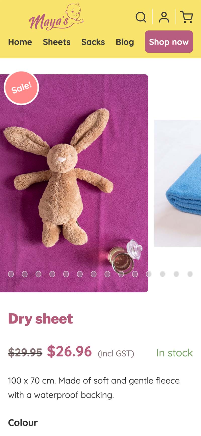
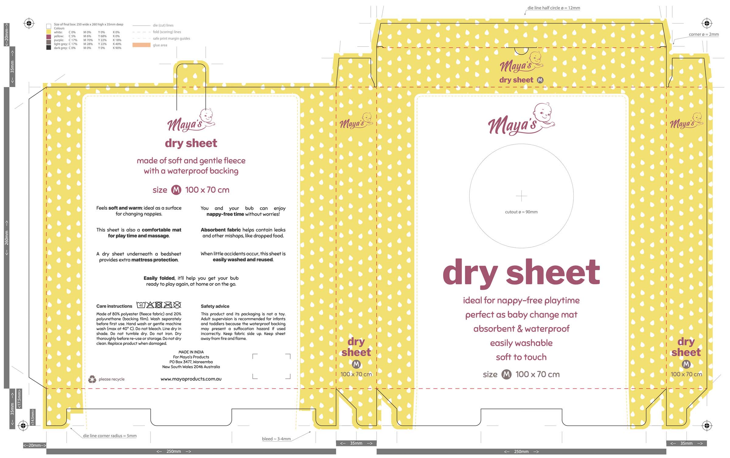
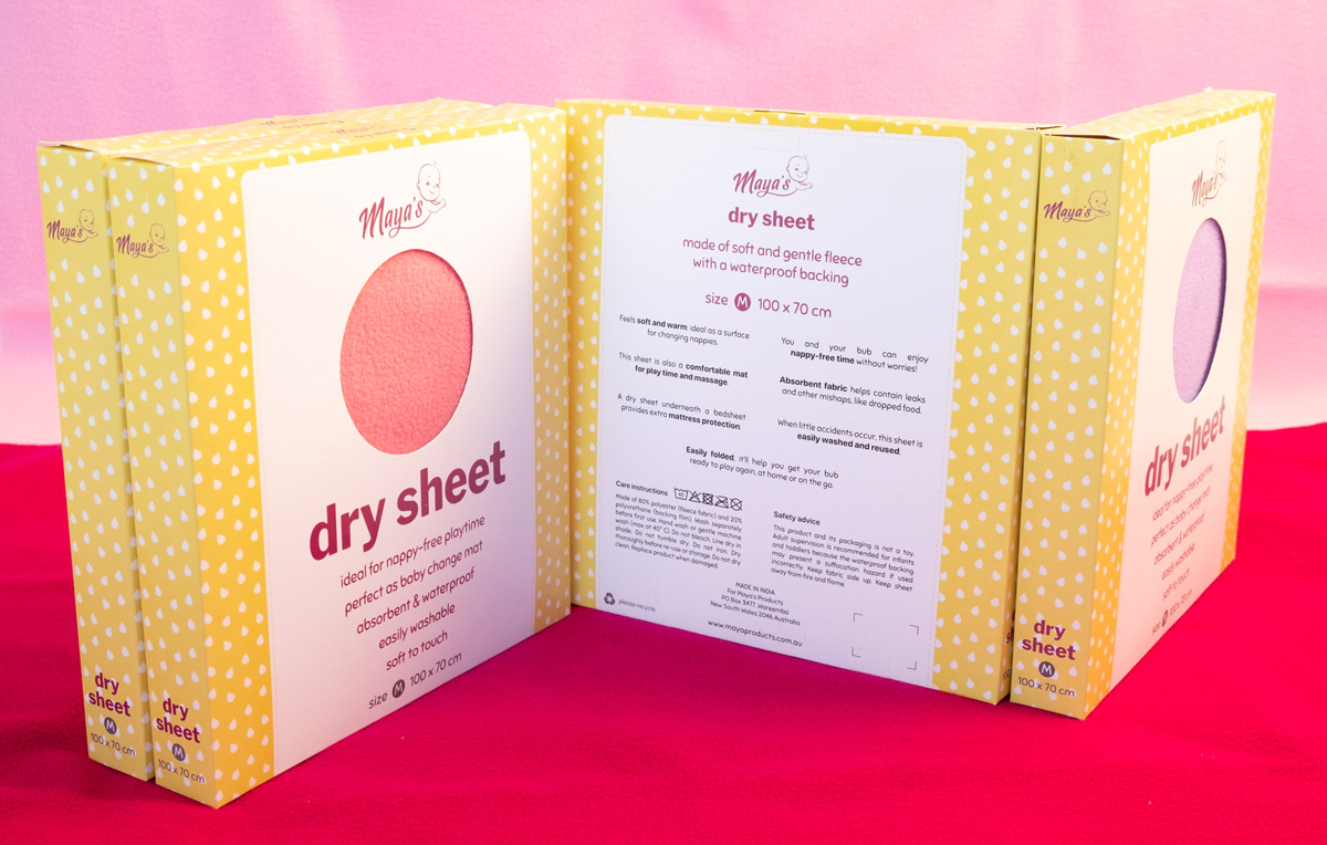
The dry sheet product has two key selling points. Its soft feel would make babies happy to sit on, lie on, and touch the sheet, while the absorbency ensures any leaks are contained. We really wanted the package to emphasise the soft aspect. Given the product’s difference from competitors' change mats, we kept the dry sheet name but this meant the packaging had to clearly outline its purpose. The final design, shown below, offers a large cutout in the middle so buyers can see and feel the actual product. The copy communicates the purpose in a direct manner.
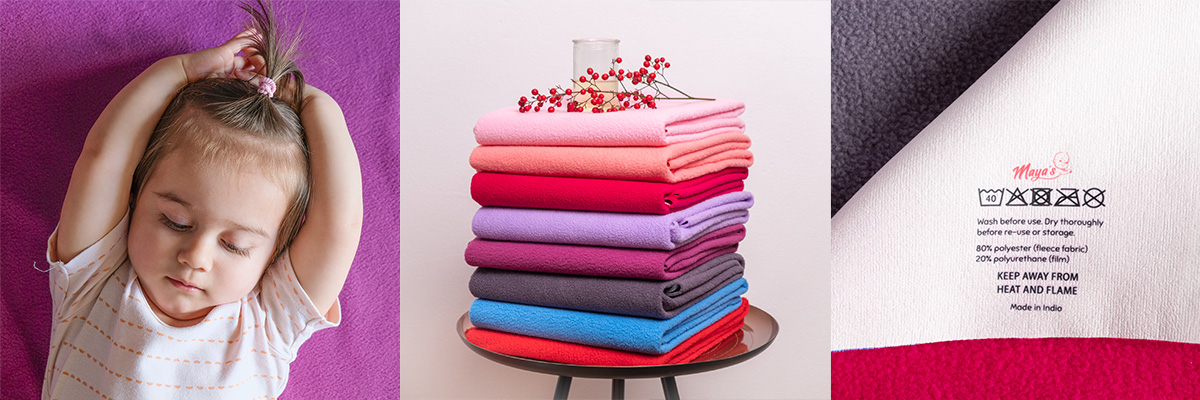
alt
Final packaging design, which adopts the use of small droplets to break up the large yellow areas and provide visual interest. These droplets became a recurring visual element in later graphic designs.

alt
Packaging with sheets visible and ready for touching through the 90mm cutout. A tight fit ensured there wouldn't be an unsightly gap between the sheets and the front of the packaging. This also reduced the chance of packaging crunching during transport, and it slightly reduced freight volume.

Photography

alt
To build up the brand and product catalog, I photographed the product (centre and right) along with aspirational images to show the product in use (left). These images were used on the website, social media, etc.

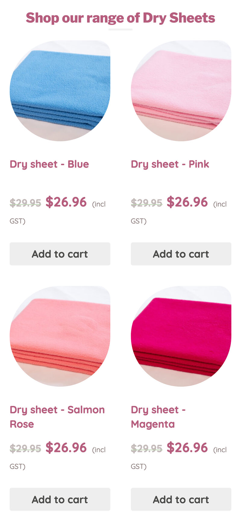
Website design & development

alt
Homepage of Mayaproducts.com.au, emphasising the key value for parents: spending more time with their child.

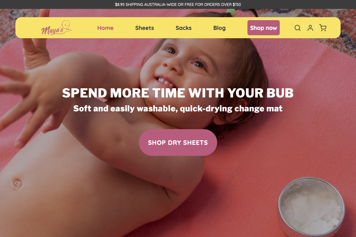
The website, at MayaProducts.com.au, is built on top of WordPress and the Woocommerce plugin to enable its online store. This solution is low cost, delivers a lot of functionality out-of-the-box, and keeps control of the content in the hands of the business owner. Also, developing for Woocommerce is fun.

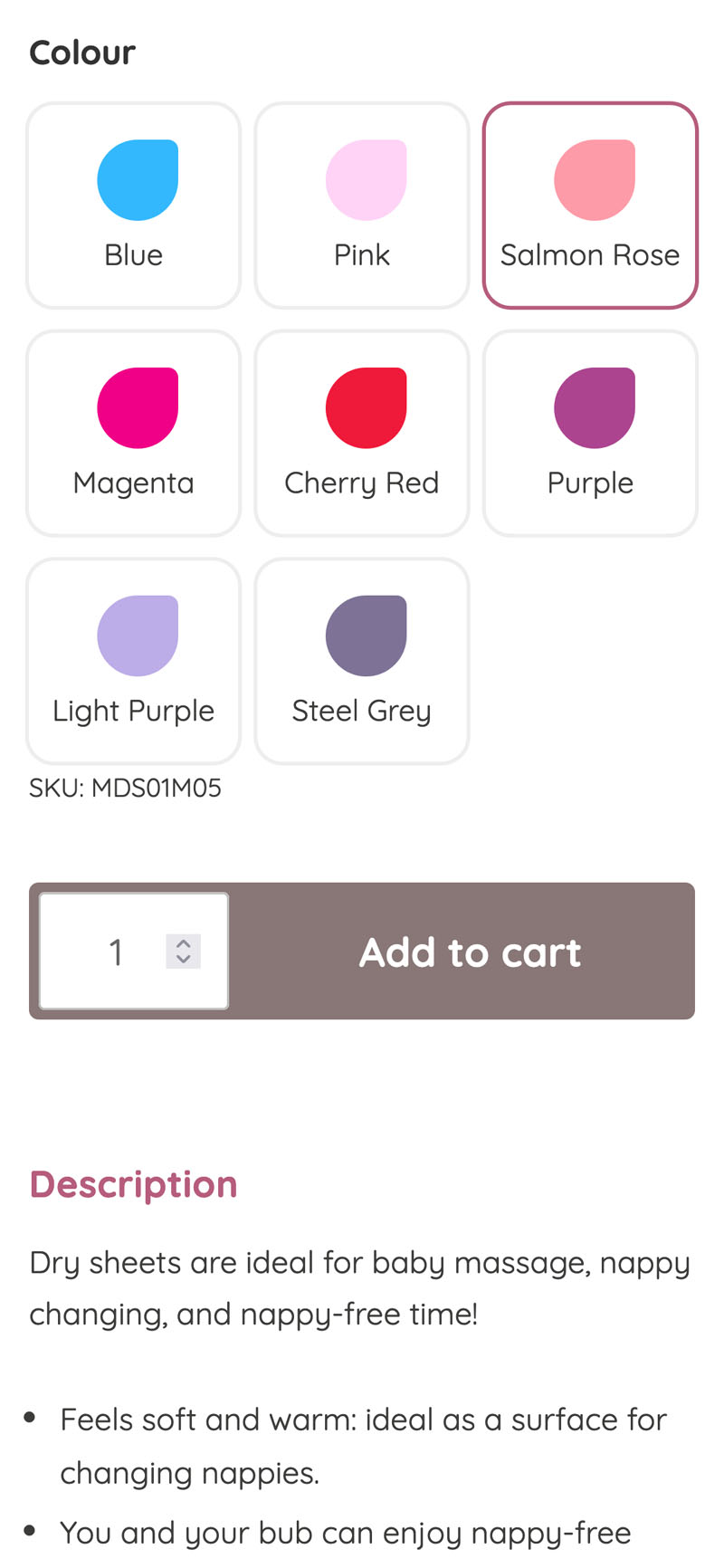
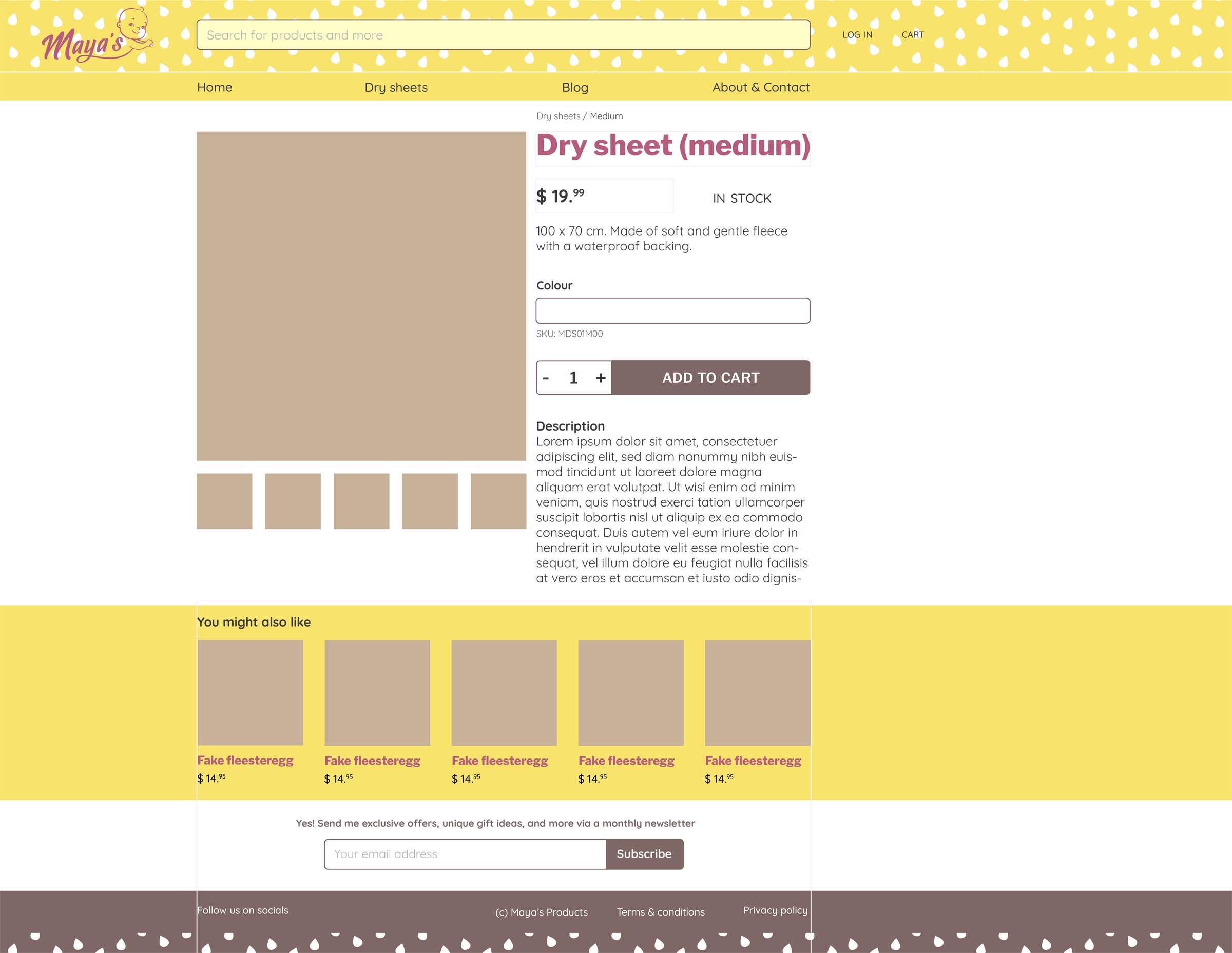
Apart from some help with the copy, my primary contribution was the development of a custom theme for the website. It caters for:

  • A distinct frontpage.
  • Product pages, with a custom-but-clearer colour selection section (by default, users select variations via a dropdown menu. Rather dull and not very colourful).
  • Regular pages, for About, Shipping info, Terms & conditions, etc.
  • Blog section.
  • A responsive design that delivers a good experience on both desktop and mobile browsers.
Three screenshots on mobile, showing the product page, colour selection, and the lower part of the front page that includes direct links to the different colours. As seen here, the droplet shape features on the website where suitable. Image legibility may be affected by the rounding of three corners, so it's something I avoid for any important or hero visuals.

alt
Early wireframe for the website, drawn in Illustrator. In the live version, the header is smaller and floats on top of any hero image but here it was still on its own, dominated by a large searchbar. Instead, with only one product on sale, I decided to make the header smaller to give more room to the rest of the page.